前言
:not() 是 CSS 選擇器中的一個偽類,它的用途是防止特定的元素被選中,也被稱作是反選偽類(negation pseudo-class)。
用於選擇除了指定元素之外的所有元素。實際應用上可以做到這樣的效果:
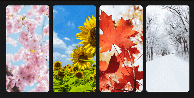
當滑鼠移至某區塊時,其他區塊會縮小寬度並降低亮度,接下來簡單紀錄 :not() 偽類可以如何使用以及如何實作。
基本使用
使用方式為 :not(selector),其中 selector 是一個 CSS 選擇器,用來指定不需要選擇的元素。
假設有多個 <p> 元素,當中只有包含 .test class 名稱的元素不套用某樣式時,就可以使用 :not() 偽類來實現。
1
2
3
4
5
| <p>文字文字</p>
<p>文字文字</p>
<p class="test">文字文字</p>
<p>文字文字</p>
<p>文字文字</p>
|
1
2
3
4
| p:not(.test) {
font-weight: bold;
color: orange;
}
|
畫面呈現結果 :
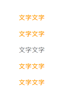
這樣就可以讓不包含 class 名稱有 test 的 所有 p 標籤套用到粗體以及橘色文字。
應用
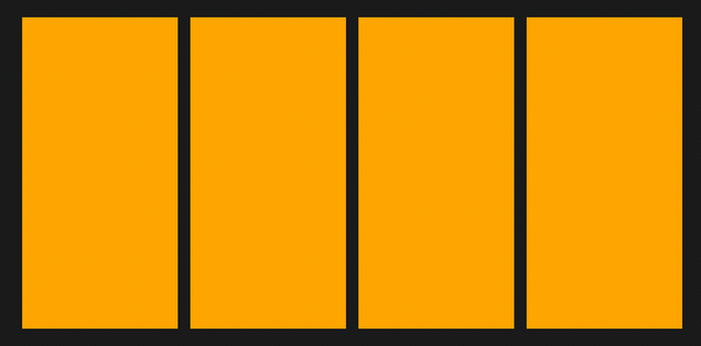
使用 :not() 就可以做到前言提到的類似效果,HTML 結構是外層 .container 元素裡面有 4 個 .box 元素,再更內層是橘色的色塊。
1
2
3
4
5
6
7
8
9
10
11
12
13
14
| <div class="container">
<div class="box">
<div class="bg"></div>
</div>
<div class="box">
<div class="bg"></div>
</div>
<div class="box">
<div class="bg"></div>
</div>
<div class="box">
<div class="bg"></div>
</div>
</div>
|
CSS 樣式 :
1
2
3
4
5
6
7
8
9
10
11
12
13
14
15
16
17
18
19
20
21
22
23
24
25
26
| .container {
display: flex;
}
.box {
width: 200px;
height: 400px;
padding-left: 8px;
padding-right: 8px;
transition: all 0.3s;
}
.bg {
width: 100%;
height: 100%;
background: orange;
}
.box:hover {
width: 500px;
}
.container:hover .box:not(:hover) {
width: 100px;
filter: brightness(0.4);
}
|
這邊設定每個 .box 元素的初始寬度為 200px,且 hover 時寬度會變為 500px。接著設定 hover 在外層 .container 元素上時,滑鼠沒有停留在 .box 元素的寬度會變為 100px 並降低亮度。
目前為止的效果會是這樣:
最後再補上文字圖片以及其他的 CSS 樣式就完成了。
完整 HTML 及 CSS
Codepen 這邊走
1
2
3
4
5
6
7
8
9
10
11
12
13
14
15
16
17
18
| <div class="container">
<div class="box">
<img src="https://images.unsplash.com/photo-1462275646964-a0e3386b89fa?q=80&w=1856&auto=format&fit=crop&ixlib=rb-4.0.3&ixid=M3wxMjA3fDB8MHxwaG90by1wYWdlfHx8fGVufDB8fHx8fA%3D%3D" alt="Spring">
<p class="text">Spring</p>
</div>
<div class="box">
<img src="https://images.unsplash.com/photo-1595126739121-68ab4225f9cf?q=80&w=1932&auto=format&fit=crop&ixlib=rb-4.0.3&ixid=M3wxMjA3fDB8MHxwaG90by1wYWdlfHx8fGVufDB8fHx8fA%3D%3D" alt="Summer">
<p class="text">Summer</p>
</div>
<div class="box">
<img src="https://images.unsplash.com/photo-1538580526402-515e3ef7076d?q=80&w=2070&auto=format&fit=crop&ixlib=rb-4.0.3&ixid=M3wxMjA3fDB8MHxwaG90by1wYWdlfHx8fGVufDB8fHx8fA%3D%3D" alt="Autumn">
<p class="text">Autumn</p>
</div>
<div class="box">
<img src="https://images.unsplash.com/photo-1414541944151-2f3ec1cfd87d?q=80&w=2074&auto=format&fit=crop&ixlib=rb-4.0.3&ixid=M3wxMjA3fDB8MHxwaG90by1wYWdlfHx8fGVufDB8fHx8fA%3D%3D" alt="Winter">
<p class="text">Winter</p>
</div>
</div>
|
1
2
3
4
5
6
7
8
9
10
11
12
13
14
15
16
17
18
19
20
21
22
23
24
25
26
27
28
29
30
31
32
33
34
35
36
37
38
39
40
41
42
43
44
45
46
47
48
49
50
51
52
53
54
55
56
57
58
59
60
61
62
63
64
65
66
67
68
69
70
71
| body {
display: flex;
align-items: center;
justify-content: center;
height: 95vh;
background: #1a1a1a;
}
img {
max-width: 100%;
height: 100%;
object-fit: cover;
border-radius: 12px;
}
.container {
display: flex;
}
.container:hover .box:not(:hover) {
width: 100px;
filter: brightness(0.4);
}
.box {
width: 200px;
height: 400px;
position: relative;
transition: width 0.3s, filter 0.3s;
padding-left: 8px;
padding-right: 8px;
}
.box::after {
opacity: 0;
content: "";
position: absolute;
bottom: 0;
left: 0;
height: 200px;
width: 100%;
background: linear-gradient(transparent, #1a1a1a);
transition: opacity 0.3s;
}
.box:hover {
width: 500px;
}
.box:hover::after {
opacity: 1;
}
.box:hover .text {
opacity: 1;
bottom: 24px;
transition: bottom 0.3s 0.3s, opacity 0.3s 0.3s;
}
.text {
opacity: 0;
font-size: 36px;
font-style: italic;
color: #fff;
letter-spacing: 0.1em;
position: absolute;
bottom: 4px;
left: 36px;
z-index: 1;
}
|
參考資料
:not() - CSS: Cascading Style Sheets | MDN