前言
在前一篇文有提到 CKEditor5 的基本使用,這篇文來分享如何客製工具列。
工具列基本設定
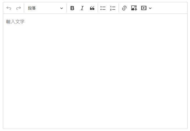
目前工具列已經有許多功能可以使用,如果想增加/減少在工具列的項目,可以在 editorConfig 增加工具列設定,調整成自己想要的順序以及項目。
1
2
3
4
5
6
7
8
9
10
| editorConfig: {
toolbar: {
items: [
'undo', 'redo', '|','heading', '|',
'bold', 'italic', 'blockQuote', '|',
'bulletedList', 'numberedList', '|',
'link','imageUpload', 'mediaEmbed', '|',
]
},
}
|
在 editorConfig 底下新增一個 toolbar 的物件,這邊可以放工具列的相關設定。我們在底下新增 items 陣列,陣列裡面放置工具列項目,並用 '|' 來做區隔。
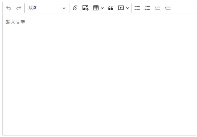
移除工具列項目
工具列本身有預設的項目與排序,如果只是想要移除特定幾個項目,也可以使用設定 removeItems 的方式來移除預設項目,不需要全部重新撰寫。
1
2
3
4
5
| editorConfig: {
toolbar: {
removeItems: ['bold', 'italic']
},
}
|
這邊移除了粗體以及斜體的項目,其他皆是工具列預設項目。
工具列自動換行
1
2
3
4
5
| editorConfig: {
toolbar: {
shouldNotGroupWhenFull: true
},
}
|
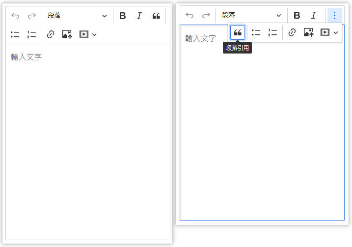
將 shouldNotGroupWhenFull 設定為 true 的話,當工具列寬度不夠時會換到下一行;若設定為 false ,當工具列項目超出可容納範圍則會顯示三個小點,點擊可以看到全部項目。(預設是 false)
下圖左邊是設定 true,右邊是設定 false。
工具列換行
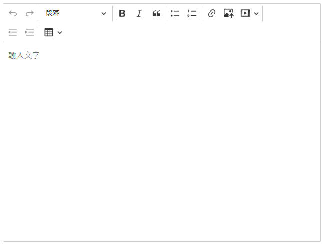
在 shouldNotGroupWhenFull: true 的情況下,可以加入 '-' 來設定斷點,在 '-' 後的項目會換到下一行。
1
2
3
4
5
6
7
8
9
10
11
12
13
| editorConfig: {
toolbar: {
items: [
'undo', 'redo', '|','heading', '|',
'bold', 'italic', 'blockQuote', '|',
'bulletedList', 'numberedList', '|',
'link','imageUpload', 'mediaEmbed', '|',
'-',
'outdent', 'indent', '|','insertTable'
],
shouldNotGroupWhenFull: true
},
}
|
工具列項目群組
我們也可以把同性質的項目放到下拉選單中來節省工具列空間。
1
2
3
4
5
6
7
8
9
10
11
12
| editorConfig: {
toolbar: {
items: [
...
{
label: '列表',
items: ['bulletedList', 'numberedList'],
},
...
],
},
}
|
在 items 底下增加一個物件,裡面包含 label 以及 items,label 可自定義文字內容,當滑鼠移到工具列選項時就會顯示 label 所設定的字串。而 items 則是一個陣列,放入要在下拉選單中出現的項目。
打開下拉選單的按鈕預設是三個小點的圖示加上一個箭頭圖示(橘框),點開來就可以看到 items 陣列裡面的項目了。
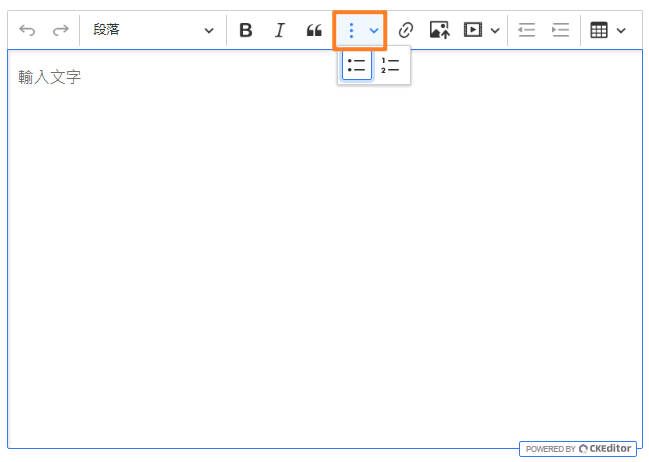
客製項目群組按鈕
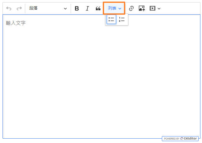
以文字取代 icon
如果不希望顯示 icon,設定 icon: false 就可以隱藏 icon,同時 label 的字串會顯示在畫面上。
1
2
3
4
5
6
7
8
9
10
11
12
13
| editorConfig: {
toolbar: {
items: [
...
{
label: '列表',
items: ['bulletedList', 'numberedList'],
icon: false
},
...
],
},
}
|
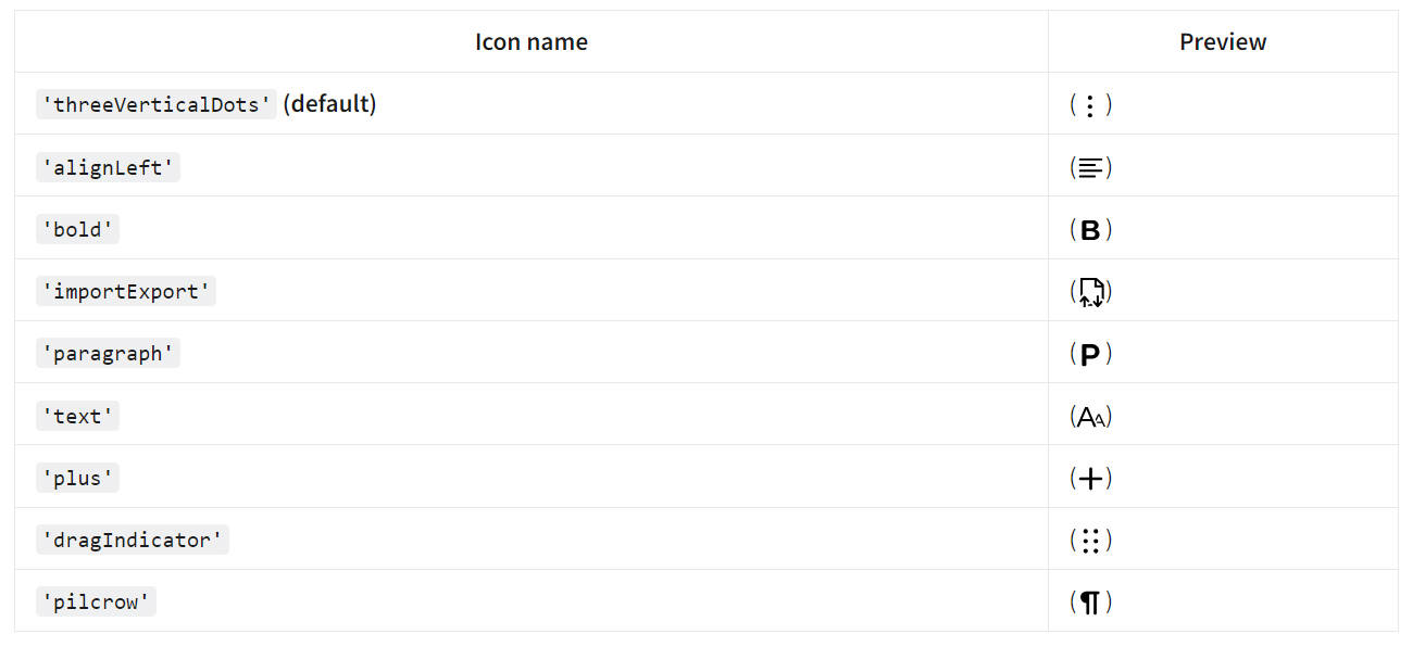
使用官方提供的 icon
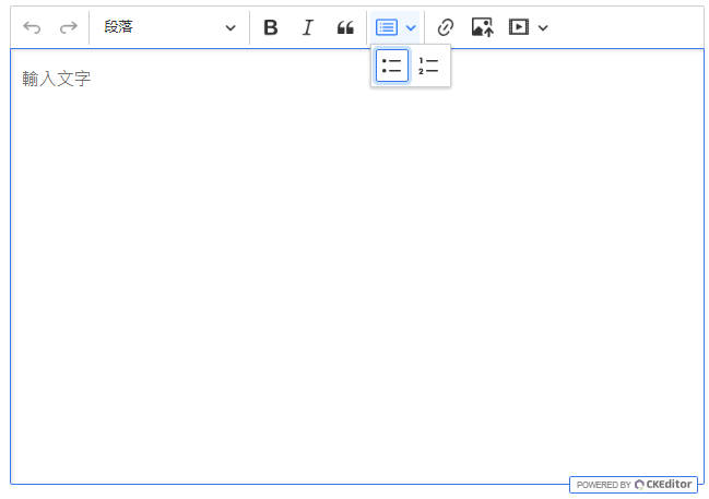
如果想更換群組按鈕的 icon,可以使用文件提供的名稱,將名稱字串貼到 icon 即可。
1
2
3
4
5
6
7
8
9
10
11
12
13
| editorConfig: {
toolbar: {
items: [
...
{
label: '列表',
items: ['bulletedList', 'numberedList'],
icon: 'dragIndicator'
},
...
],
},
}
|
自訂 icon
要使用其他的 icon,可以傳入 svg 格式的字串來自訂圖示。
1
2
3
4
5
6
7
8
9
10
11
12
13
| editorConfig: {
toolbar: {
items: [
...
{
label: '列表',
items: ['bulletedList', 'numberedList'],
icon: '<svg xmlns="http://www.w3.org/2000/svg" width="16" height="16" fill="currentColor" class="bi bi-card-list" viewBox="0 0 16 16"><path d="M14.5 3a.5.5 0 0 1 .5.5v9a.5.5 0 0 1-.5.5h-13a.5.5 0 0 1-.5-.5v-9a.5.5 0 0 1 .5-.5zm-13-1A1.5 1.5 0 0 0 0 3.5v9A1.5 1.5 0 0 0 1.5 14h13a1.5 1.5 0 0 0 1.5-1.5v-9A1.5 1.5 0 0 0 14.5 2z"/><path d="M5 8a.5.5 0 0 1 .5-.5h7a.5.5 0 0 1 0 1h-7A.5.5 0 0 1 5 8m0-2.5a.5.5 0 0 1 .5-.5h7a.5.5 0 0 1 0 1h-7a.5.5 0 0 1-.5-.5m0 5a.5.5 0 0 1 .5-.5h7a.5.5 0 0 1 0 1h-7a.5.5 0 0 1-.5-.5m-1-5a.5.5 0 1 1-1 0 .5.5 0 0 1 1 0M4 8a.5.5 0 1 1-1 0 .5.5 0 0 1 1 0m0 2.5a.5.5 0 1 1-1 0 .5.5 0 0 1 1 0"/></svg>'
},
...
],
},
}
|
查看所有工具列項目
使用預定義版本的話,可以至文件查看可以用的功能,也可以透過下面的方式來取得所有可以放在 items 的項目。
1
2
3
4
5
6
7
8
9
10
11
12
13
14
15
16
17
18
19
20
21
22
23
24
25
26
27
28
29
| // EditorComp.vue
<template>
<ckeditor
...
@ready="onEditorReady"
></ckeditor>
</template>
<script>
import ClassicEditor from '@ckeditor/ckeditor5-build-classic'
export default {
data() {
return {
...
editorConfig: {
toolbar: {
items: ...
},
}
};
},
methods: {
onEditorReady(editor) {
console.log(Array.from(editor.ui.componentFactory.names()))
}
}
}
</script>
|
這邊在 methods 定義了 onEditorReady 方法並帶入 editor 參數,當編輯器準備完成時就會觸發該方法,印出所有工具列項目的陣列。
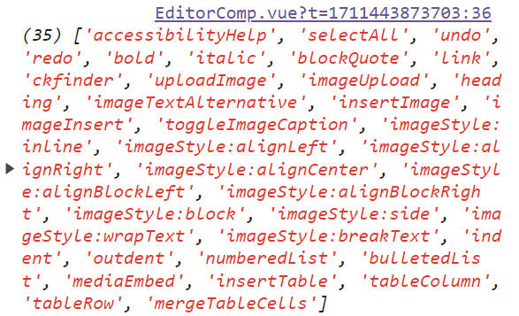
接著把該陣列複製到 items 後,畫面上就可以看到所有的項目出現在工具列上,就可以自行調整工具列的排版與內容了。
參考資料
Editor toolbar | CKEditor 5 Documentation
Vue.js 3+ rich text editor component | CKEditor 5 documentation